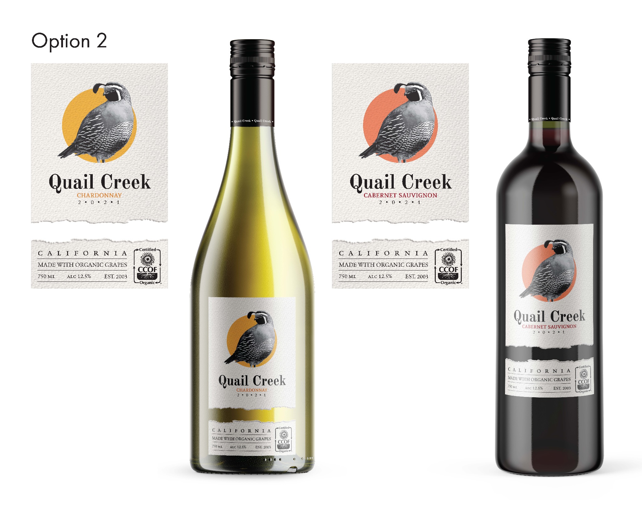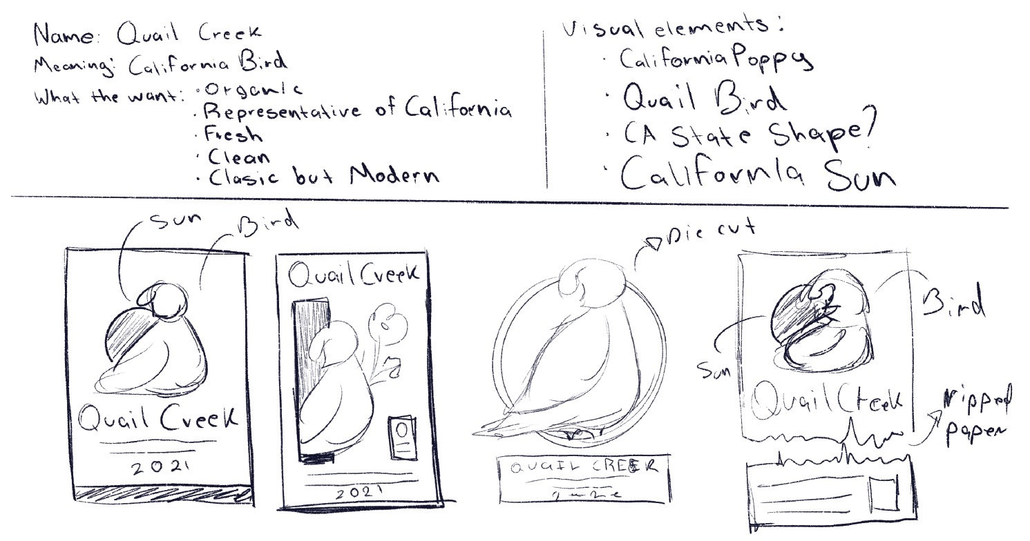
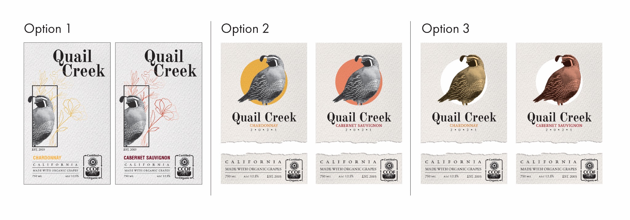
The client came to us for this design with the name he wanted, "Quail Creek."
He wanted something related to California since it would be a Californian Wine. He liked the idea of Quail since it would be an organic wine, so the iteration process began.
My first thought was to include the California poppies. I wanted to create a halfway modern design mixed with a classic in a watercolor type of paper, and the California Sun could not be missing here, either.
The challenge with Quail Creek was the font. Finding the right font was the most time-consuming process of the entire project; I tried several different families, even though I was sure I needed a serif bold font, a mix between Times New Roman and Bauhaus.
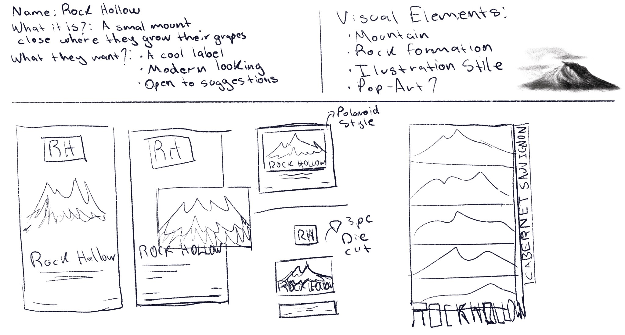
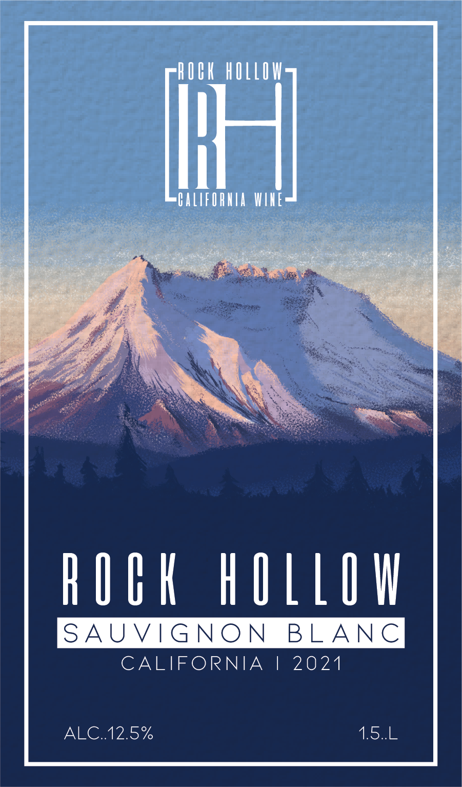
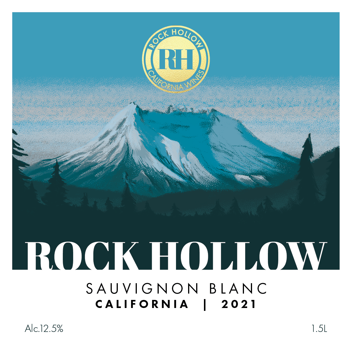
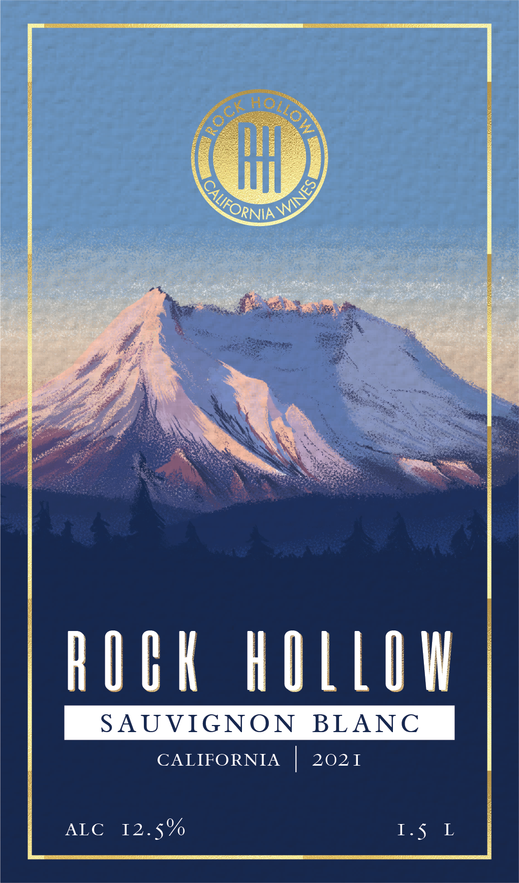
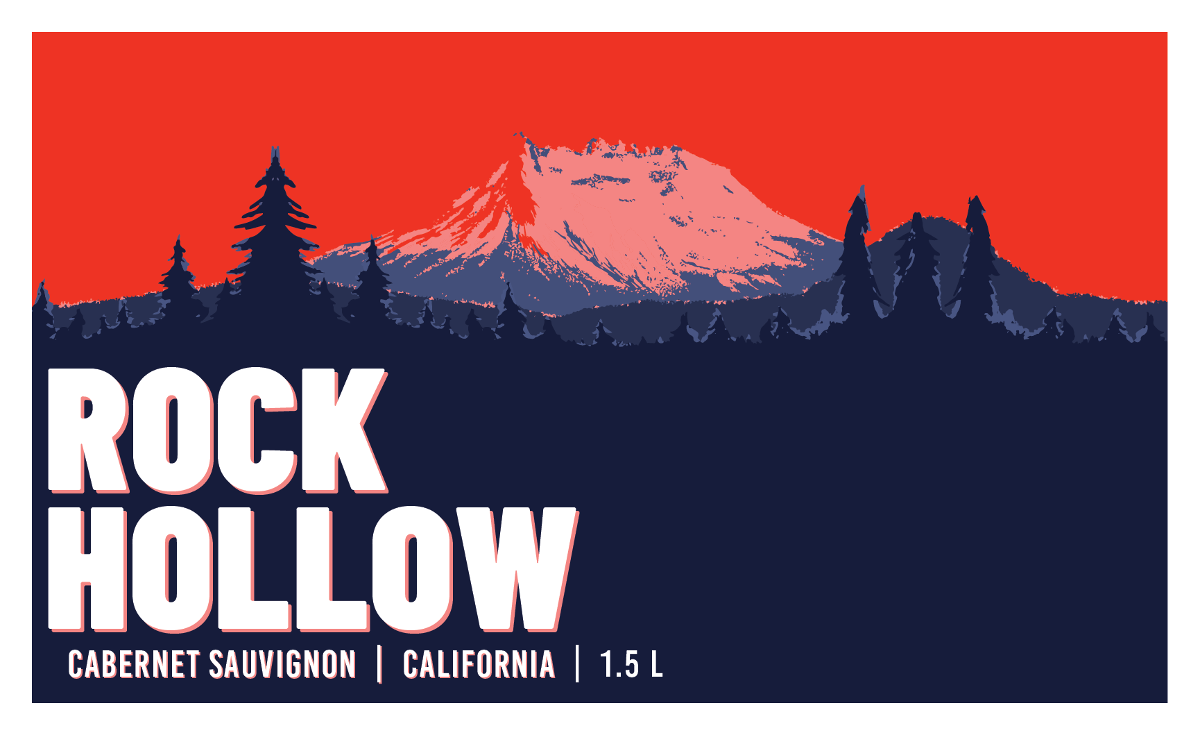
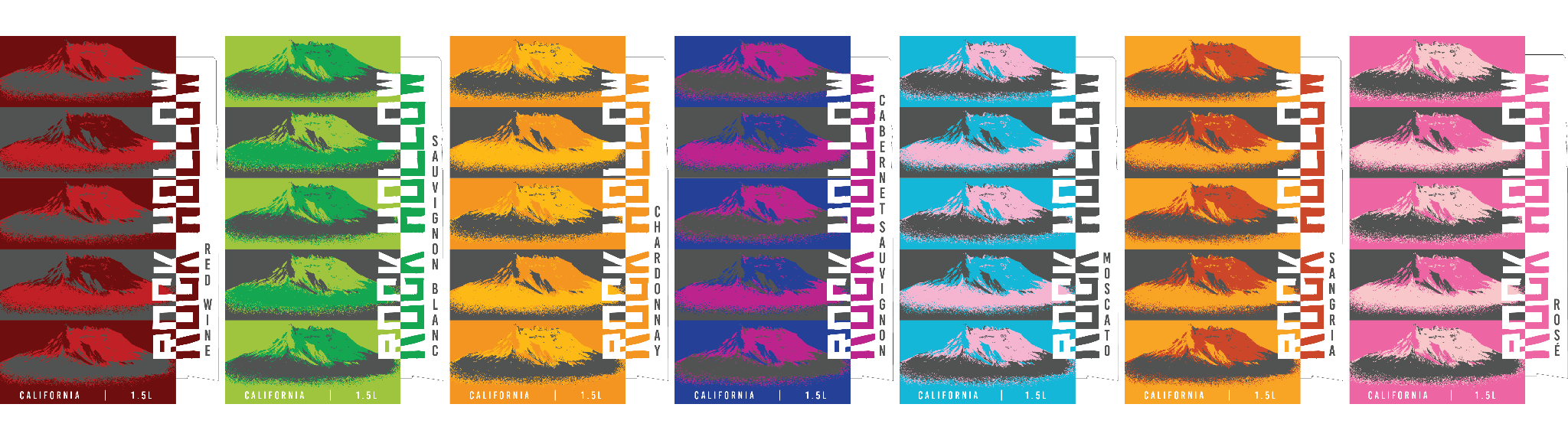
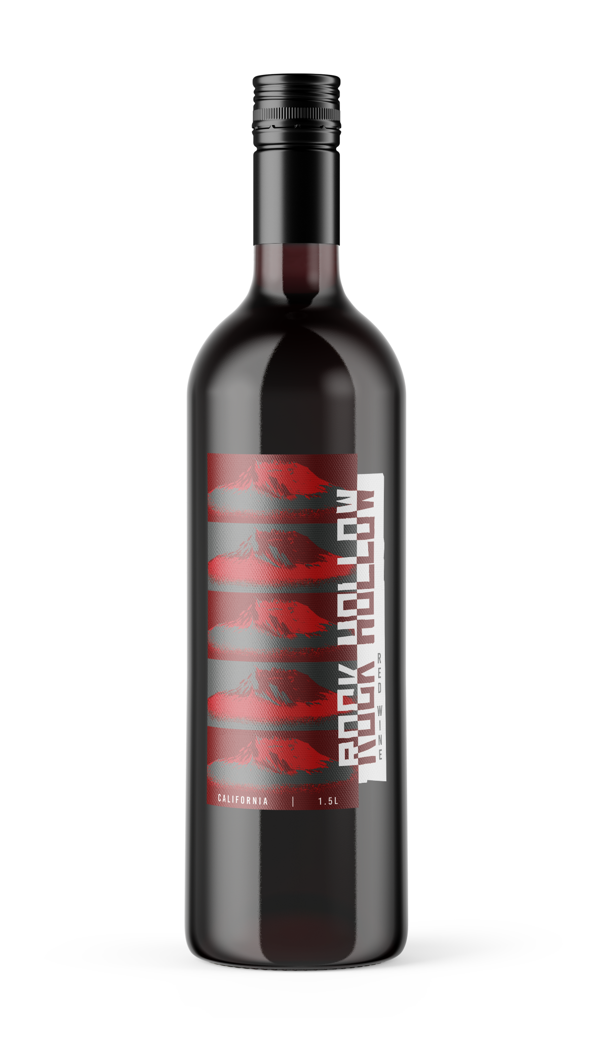
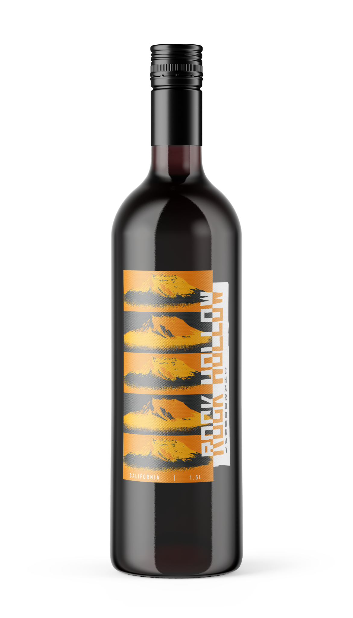
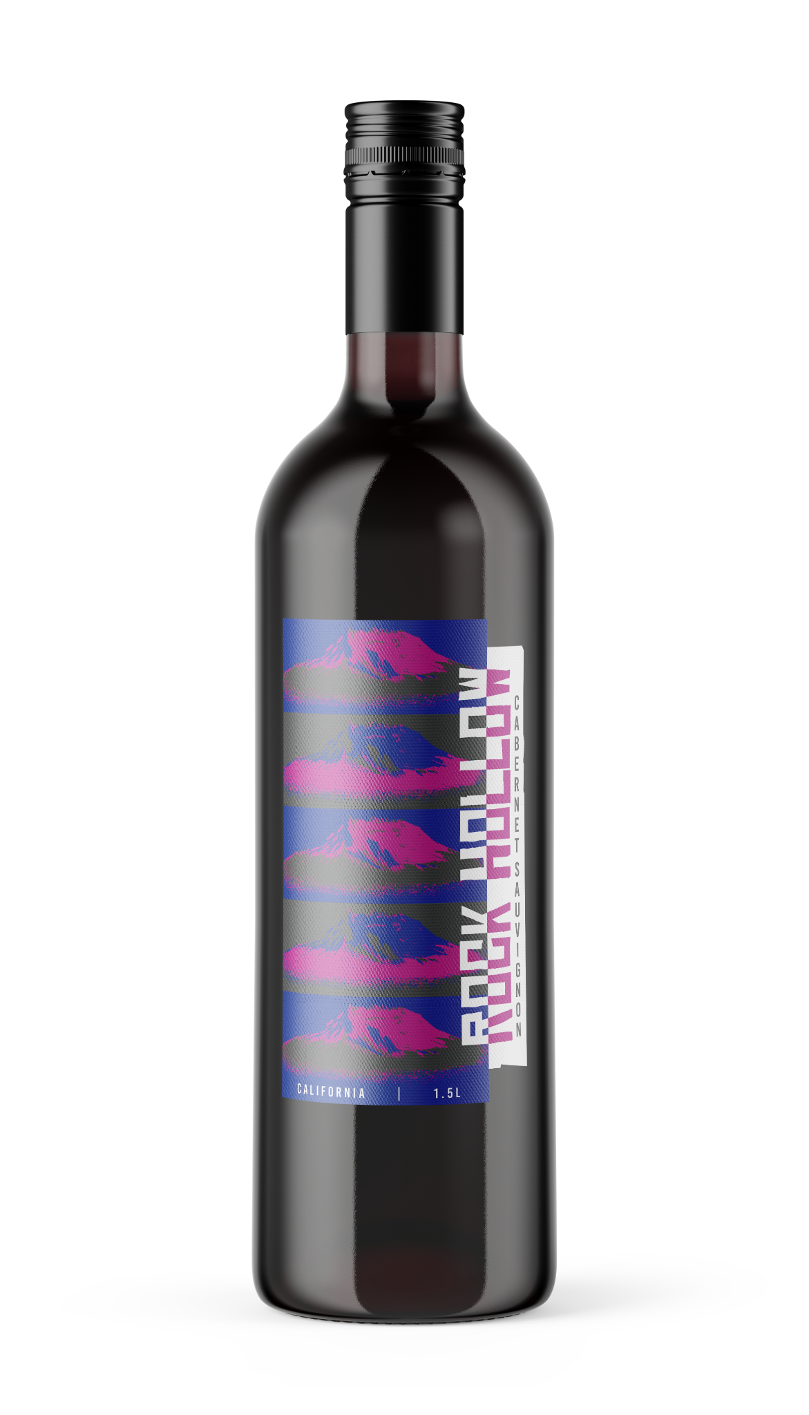
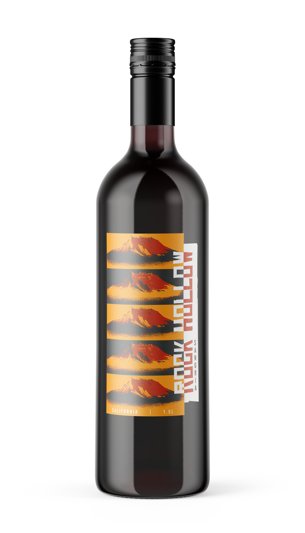
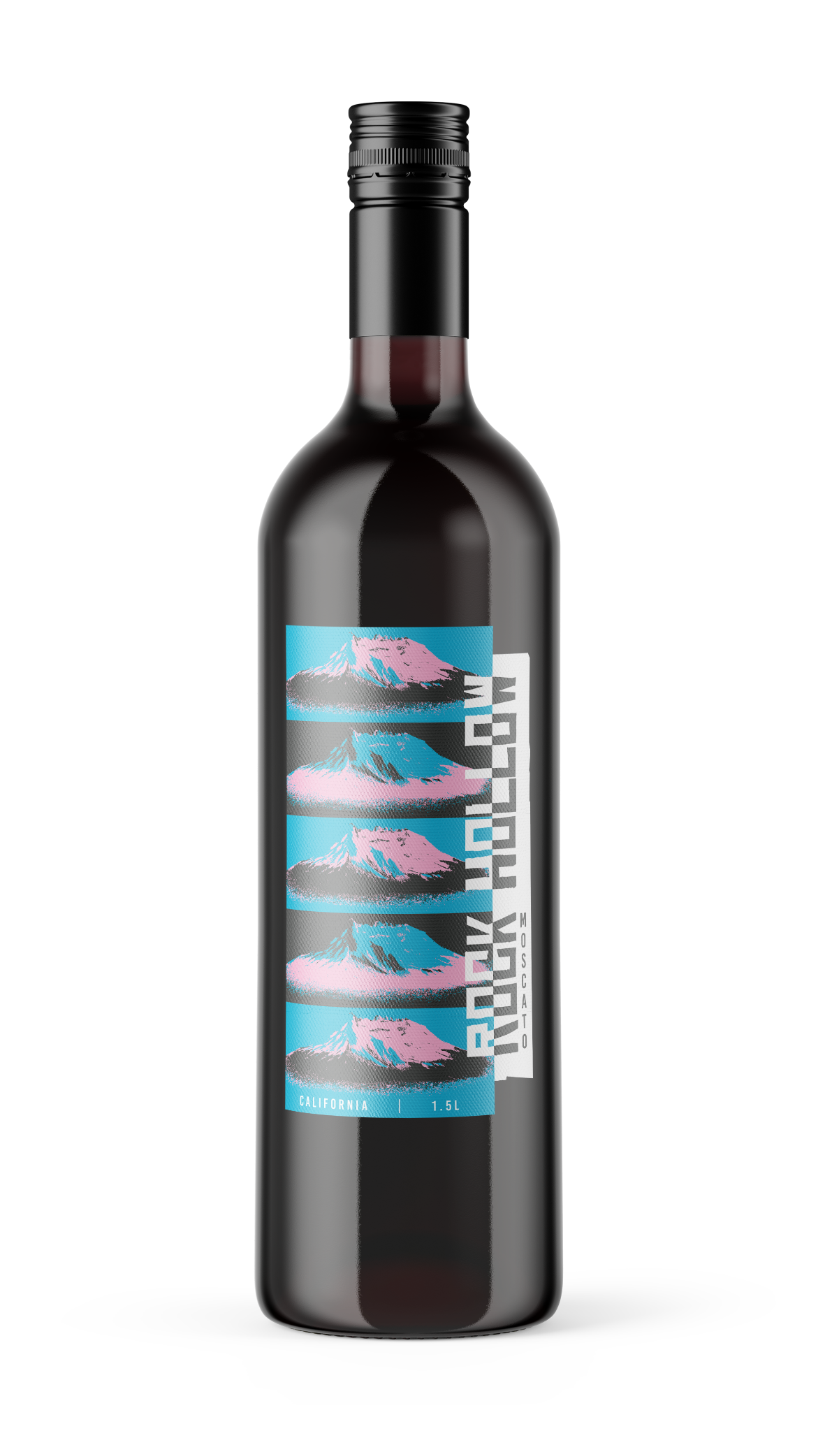
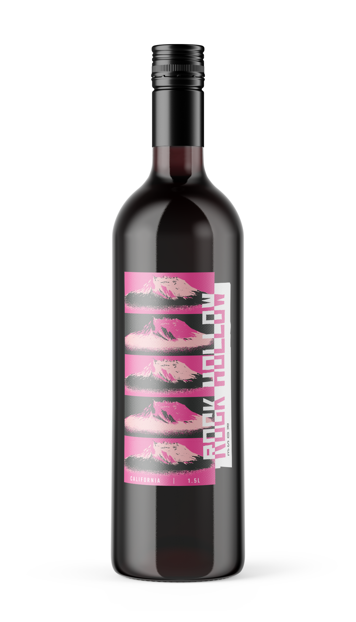
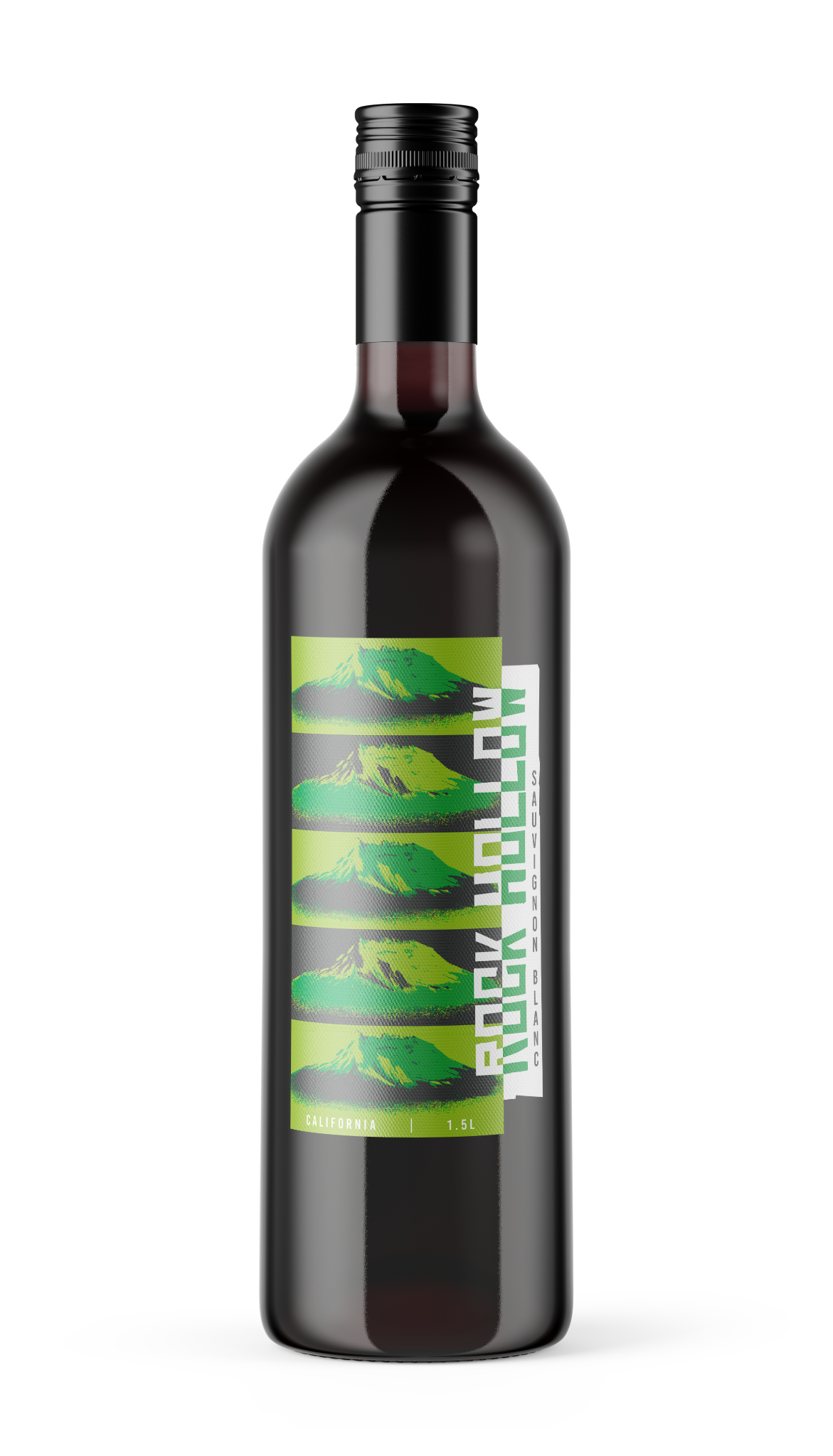
The client came to us requesting a design with a name based on a small mountain that was visible from his vineyards.
He did not have an idea of what he wanted, he just showed us the picture of the mountain and he let us have full creative liberty to design something. So I used this opportunity to explore different styles and maybe make some bold choices.
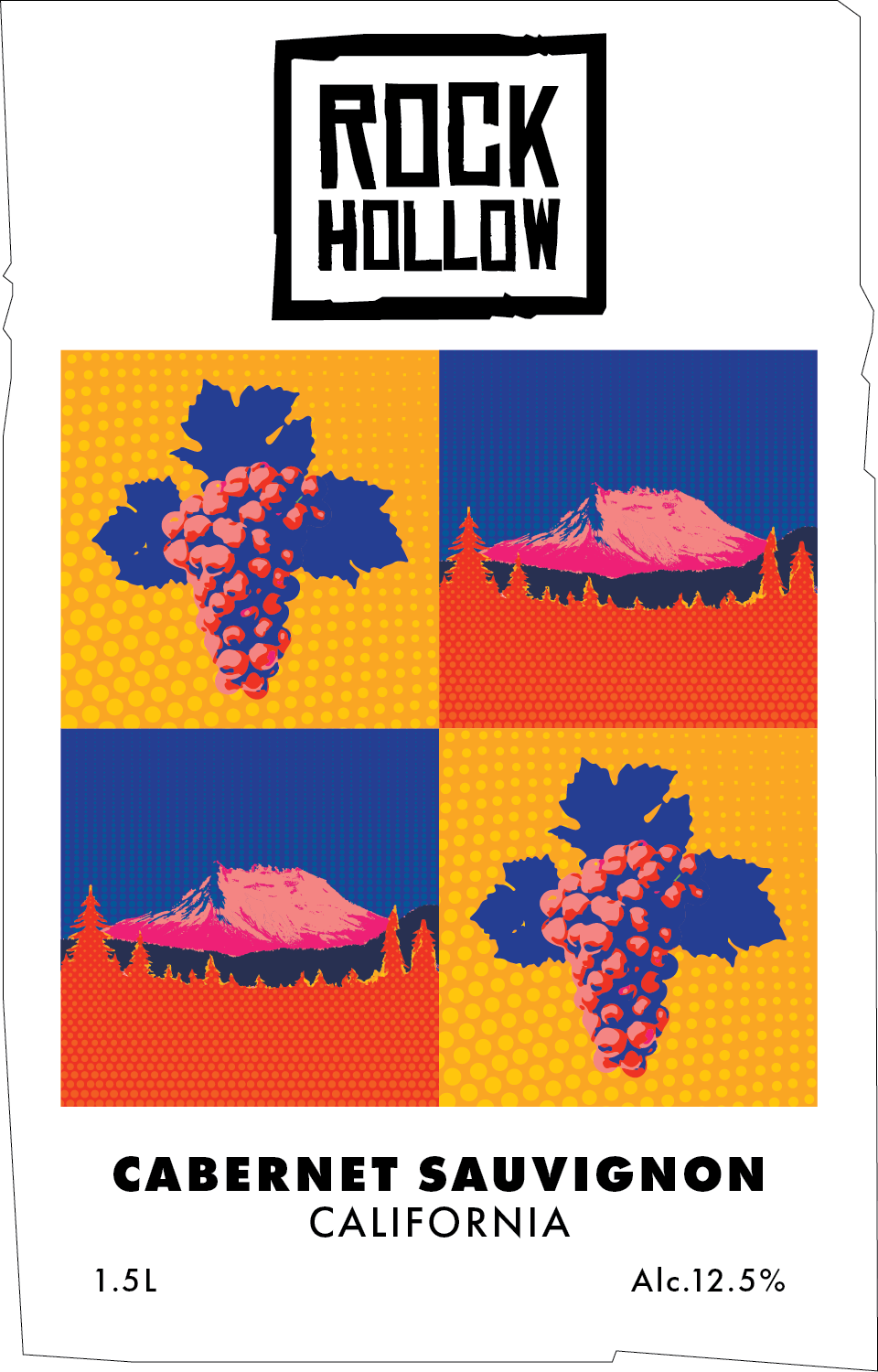
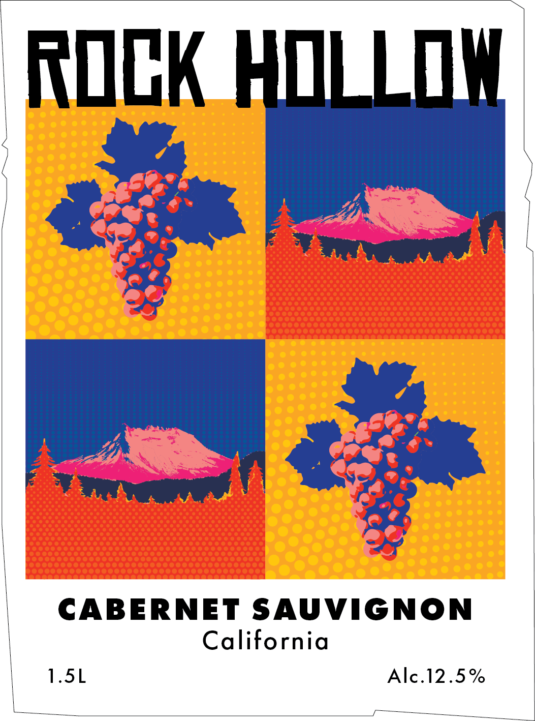
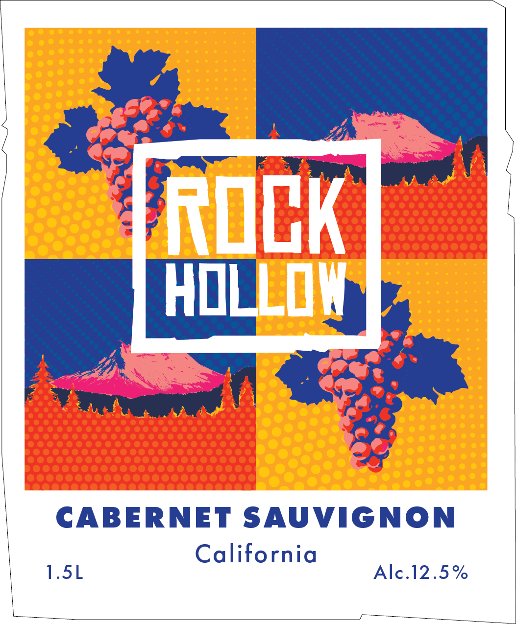
I wanted to keep the idea of the mountain since that came from him, but I wanted to do something really art-driven.
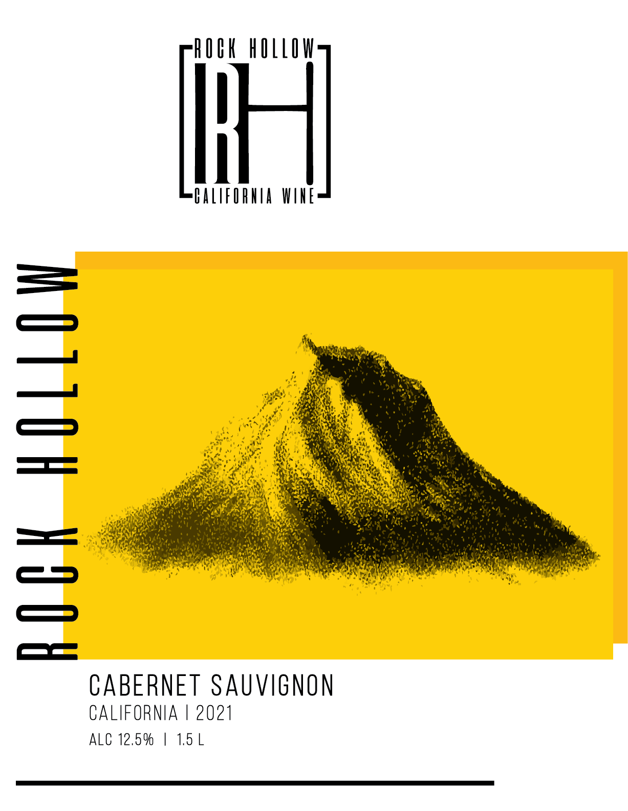
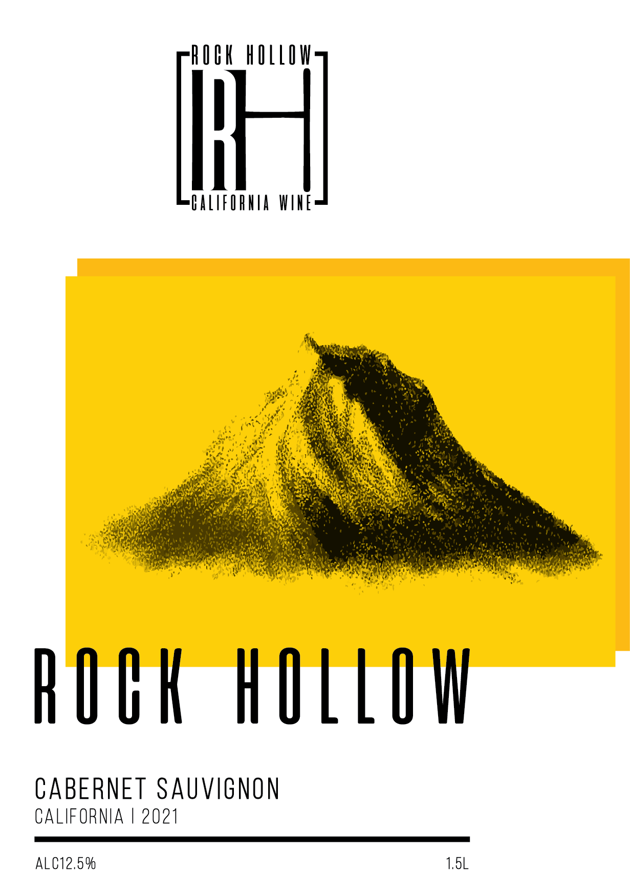
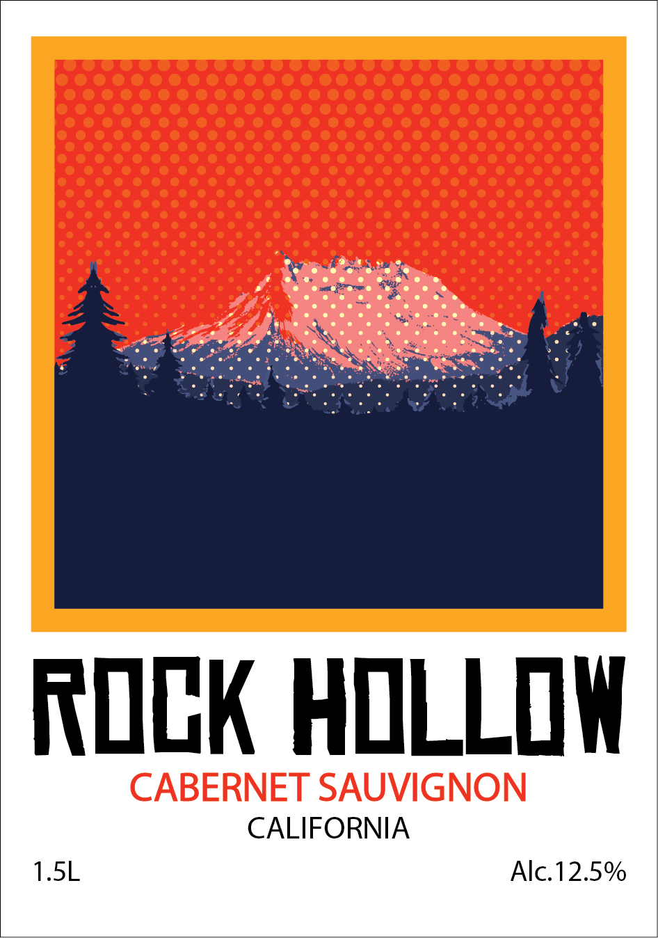
The challenge with Rock Hollow was having little to no information about what the client wanted. In my experience, finding the right art style and making the right choices depend a lot on the research and what was requested. I was grateful for the opportunity to have the freedom to express and create something without limitation, but being able to communicate with the client is always something I look forward to so I can direct my work on the right path.
After exploring classic illustration style and bold, high-contrast designs, I started playing with colors and shapes, leaning towards a pop-art style. So, I used the mountain illustration I created and recreated a pop-art inspire collage. I was mixing different colors for each wine variety.

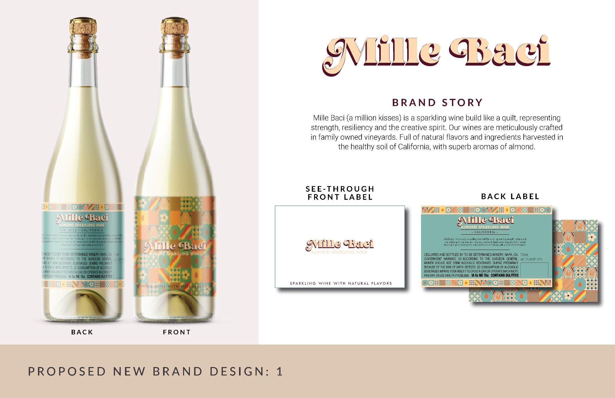
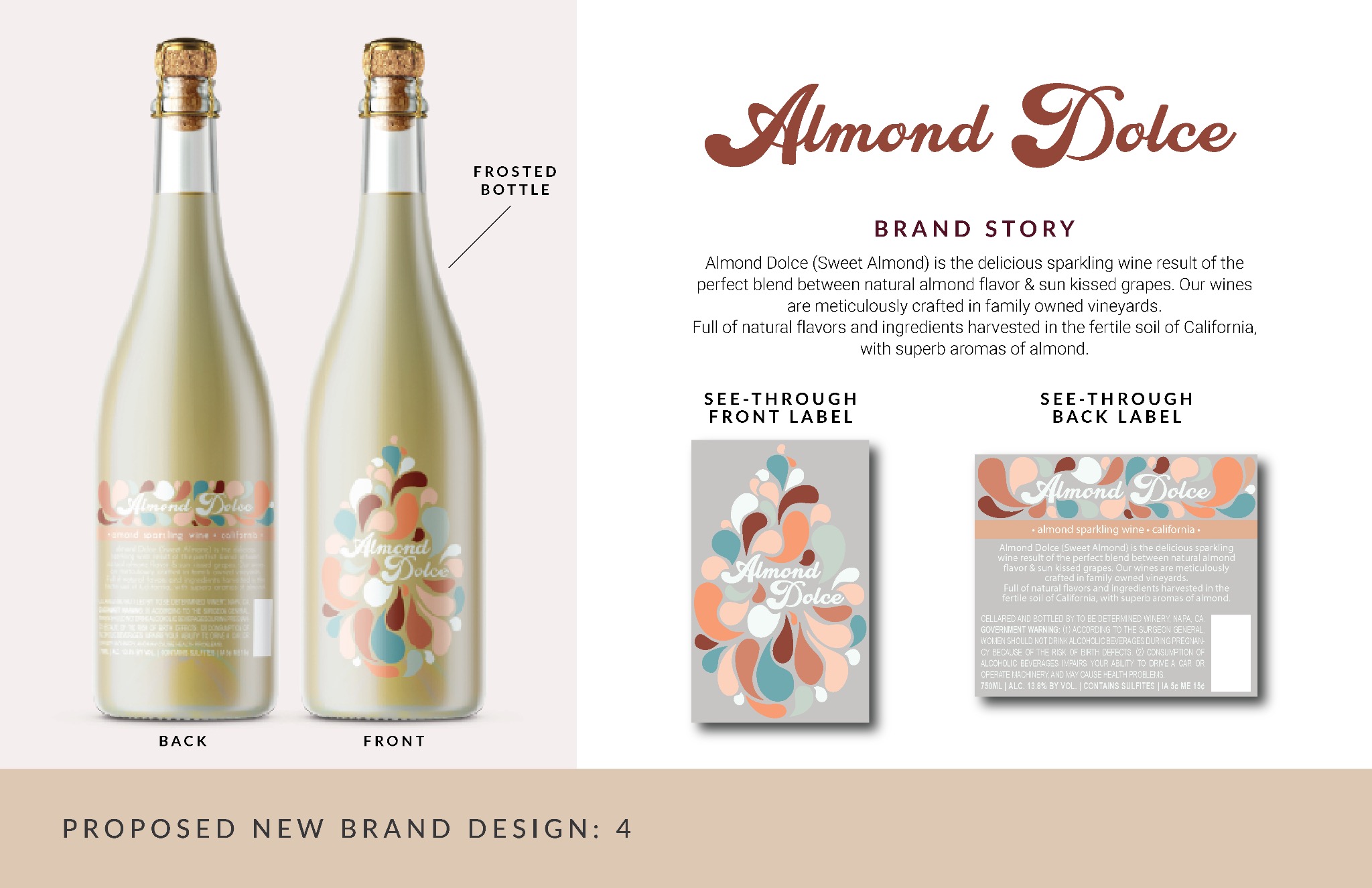
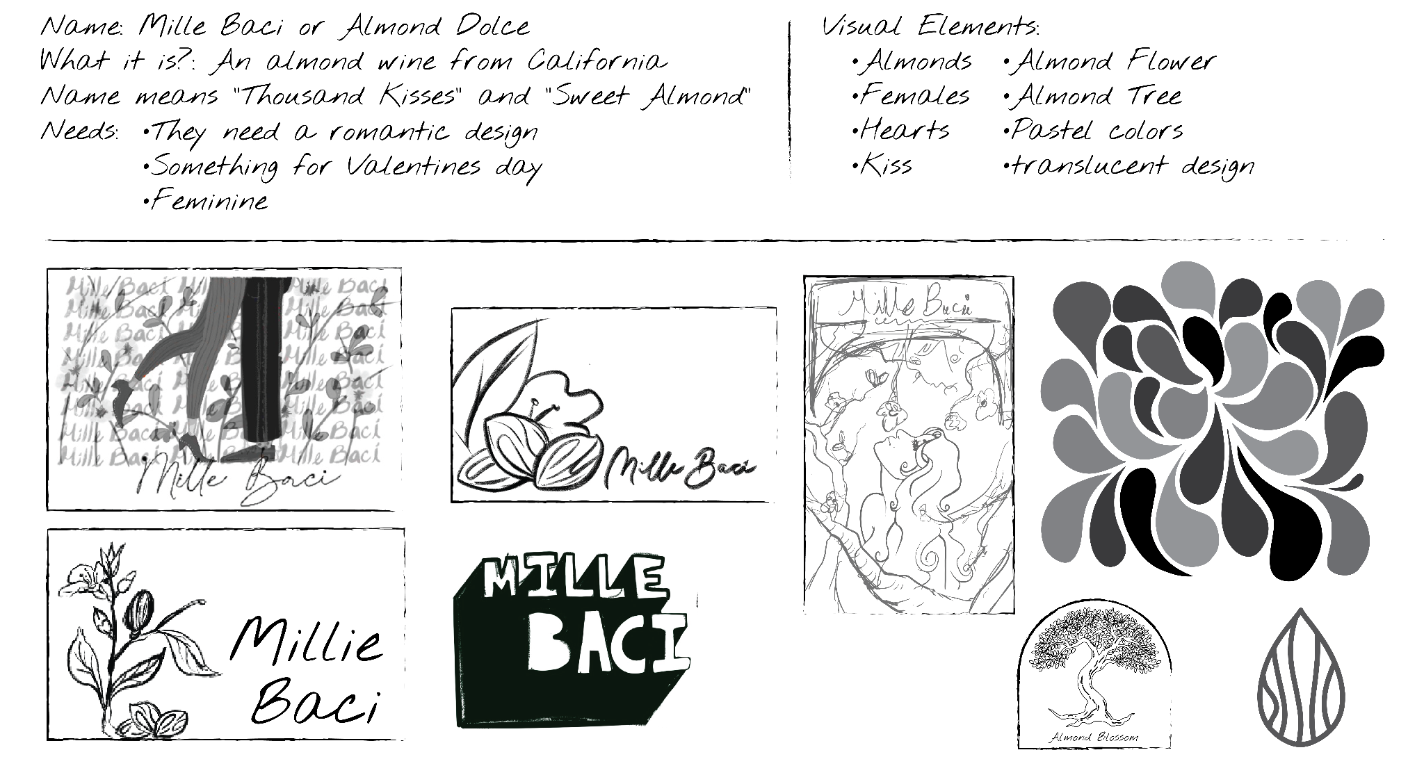
An almond wine. This was the premise for this adorable wine. Sweet and made for Valentine's Day, this wine was meant to be romantic, delicate, and feminine.
Since this was a sweet wine, my first thought was to use "Mille Bacci" for the name, but in the end, I landed on "Almond Dolce."
This was the label where I went and created the most iterations of them all.
The challenge with Almond Dolce was sticking to a particular style. During the mood boarding process, I did not narrow down as much as I should have, partly because I wanted to explore different styles and different ideas. But looking back now, I would have had a much better time working on this if I had spent more time on my research. Overall, my team was happy with the result, and the client loved how it turned out.